How are Pie Charts useful? And how should they not be used?
I’m again sharing simple Tweaks to help your charts make more sense
@clementspio Pie charts are good to as a big picture overview of each segment, but not if you want to go in detail. There is the “usual” way of showing certain data. But if your insight is something else, Then be prepared to update your visual to one that’s more appropriate. #communication #datastorytelling #Charts #Presentations #dataviz #LearnTok ♬ K.K. House (City Pop Version) – 라미아뮤직
Today’s story – A client in the retail industry giving a presentation on marketing strategy insights and updates.
Here’s a particular chart which he presented.
(Of course, I can’t share the exact one from his deck, but here’s a copy with totally made up but similar data.)
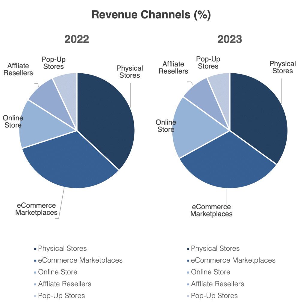
Now at first glance, if you were in the audience, what do you think the presenter is trying to tell with this visual?
Yes, he wants to compare the revenue channel percentage between 2022 and 2023.
But, as the audience, what do you think is the key insight or main message?
Is it immediately clear?
When are Pie Charts Useful?
Pie charts are good to as a big picture overview of each segment, but not if you want to go in detail.
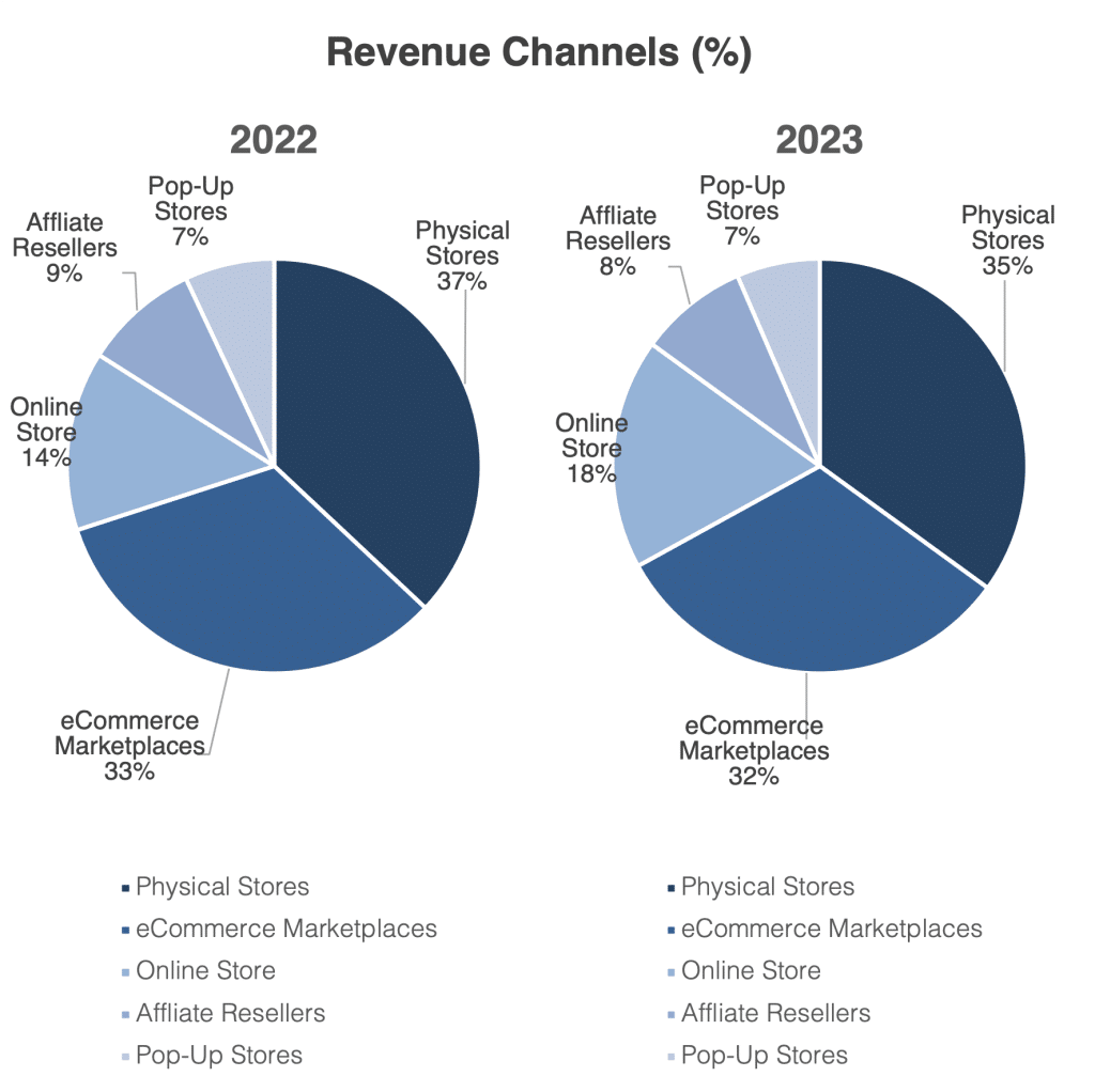
So if you want to show similarity, yes, it’s good enough.
Even better, add the values in, like this:
But no, while these are “revenue segments” typically represented through pie charts, comparing 2 pie charts side by side makes no sense.
By the way, the key insight the client wants to make is that their Online store have performed exceptionally well this year, hence the segment has increased, a little.
Did you catch that?
Is the Pie chart the best way to show this?
Pie Charts are not for Comparison
If your message is about comparison, not overview, then, a column chart is much better.
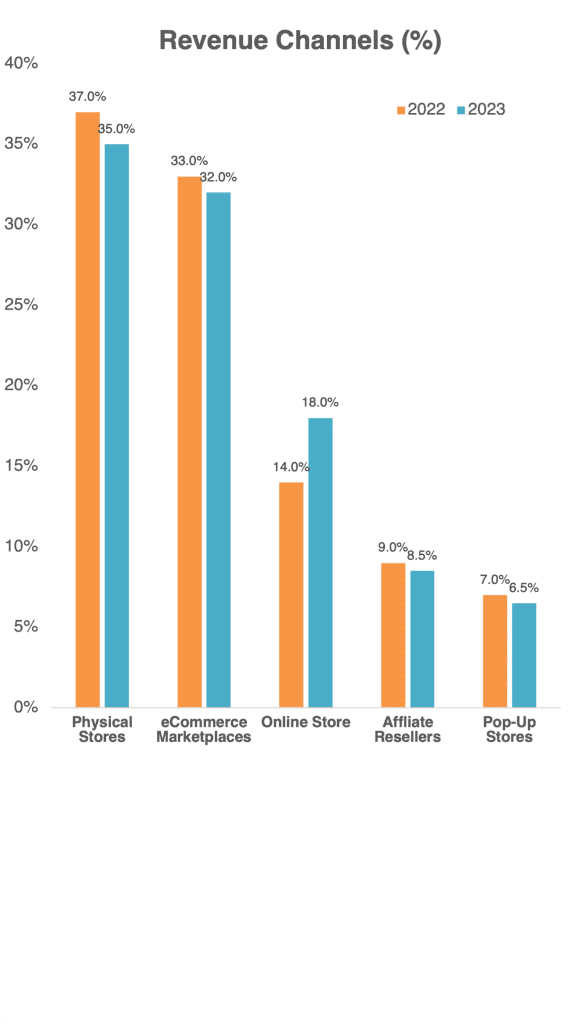
Here, it’s clear that the Online Store brought in more revenue than their other channels.
There’s more. The client added on verbally that this increase is due to the increased traction from their mobile app linked to their online store.
And I asked, “Wait, do you have data for that?
Would it be clearer if that data was added into this visual?”
And voila, here’s the new chart he came up with.

Now, it’s visually clear which channels have done better in 2023 than in 2022
This graph now fully supports the points that the presenter wants to make, and he can focus his takeaways on the relevant audience, which would be their marketing focus moving forward.
Remember, visuals are there give meaning to your data.
There is the “usual” way of showing certain data.
But if your insight is something else,
Then be prepared to update your visual to one that’s more appropriate.
Pie charts – good for big picture overview of segments, but this is one Example of How Pie Charts are Totally Inappropriate and we should Never Use Pie Charts this way!
As for column charts, this should solve the mystery if the Y-Axis should always start from zero.
Follow us on TikTok for more.